
LIVY WELLNESS APP
The Challenge:
People 40+ aspire to live a long and healthy life remaining active physically, mentally and socially. However, the abundance of information and data can be time consuming and overwhelming. Apps like Apple Health are reported to be confusing and complicated. Thus people 40+ are less likely to use Apps at all.
The Project:
LIVY, is a holistic health App, which offers “at-a-glance” data making your most important health metrics easy to view and manage.
LIVY provides trusted guidelines recommended by the CDC and medical professionals to help users to set and achieve clear data goals to improve overall health.
Deeper data analysis to assist the user in understanding their metrics throughly.
Finally, LIVY recognizes the power of community in fostering motivation and creating a sense of joy. Thus encourages users to share their data and experiences with friends and family.
MY ROLE
UX Designer
Including:
Competitor Research
User Research (Surveys, interviews, Affinity Mapping)
Persona Creation
User Flows
Information Architecture
Wire framing
Prototyping (Low Fidelity and Mid Fidelity)
Usability Testing
TOOLS
TEAM
Figma
Illustrator
Material Design
Unsplash
Remove BG
Charts
Mentor: Tasha Salgado

INITIAL PROBLEM STATEMENT
The initial hypothesis was simple, people 40+ need an understanding of doctor visit lab metrics like cholesterol, heart rate and sugar levels and recommended data goals so that they can feel empowered to improve their metrics and thus improve longevity and wellbeing.
Armed with the problem, I set forth to discover more…
DISCOVER.
COMPETITIVE ANALYSIS
Apps on the market have too much or not enough data. Most of the Apps did not address all areas of Daily Activity, Exercise, Sleep and Nutrition tracking and the usability was poor on most apps. Finally, credible information and recommendations to connect the data with real goals was missing or hard to find
Apple Health
Garmin Connect
Strava
My Fitness Pal
My Net Diary
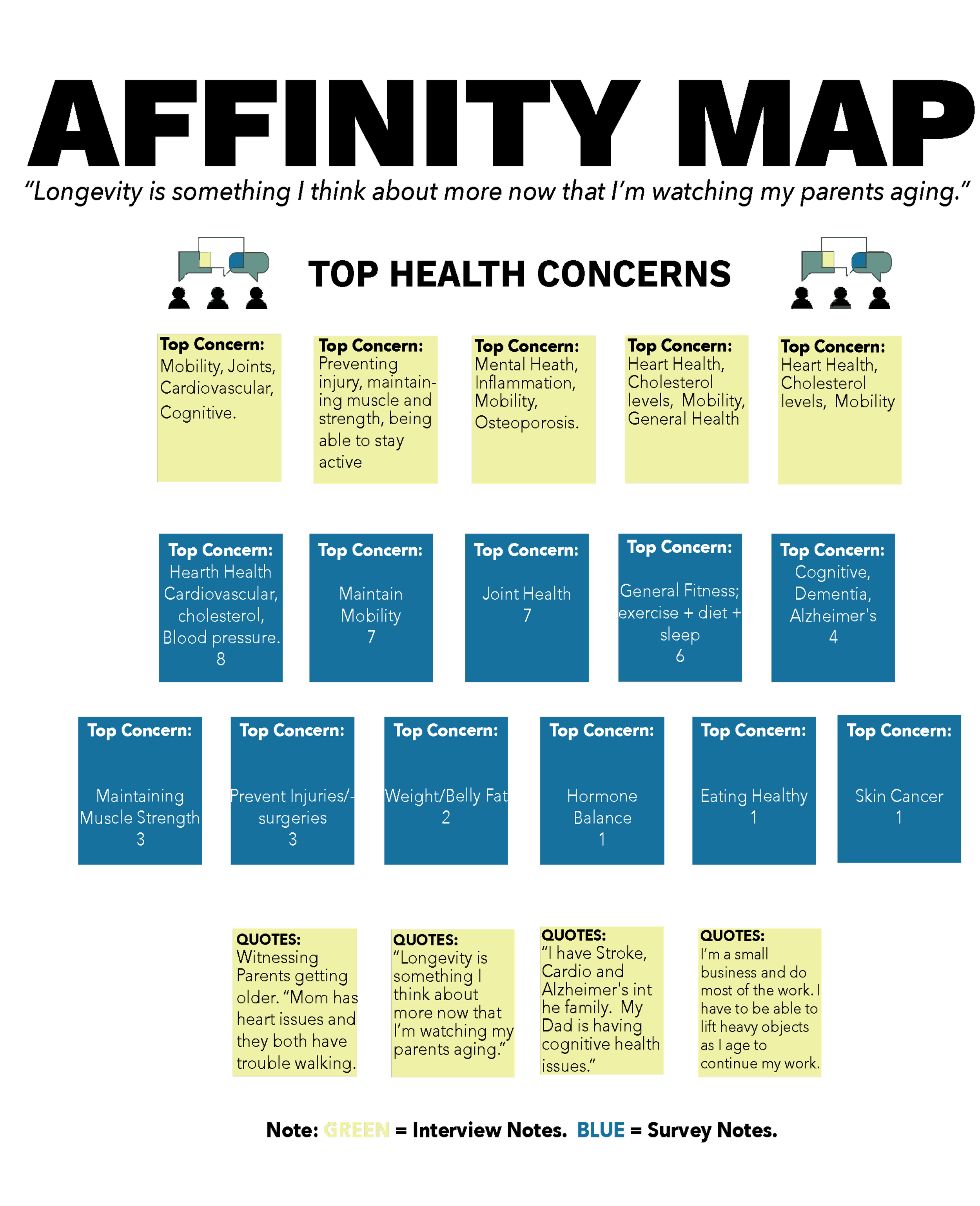
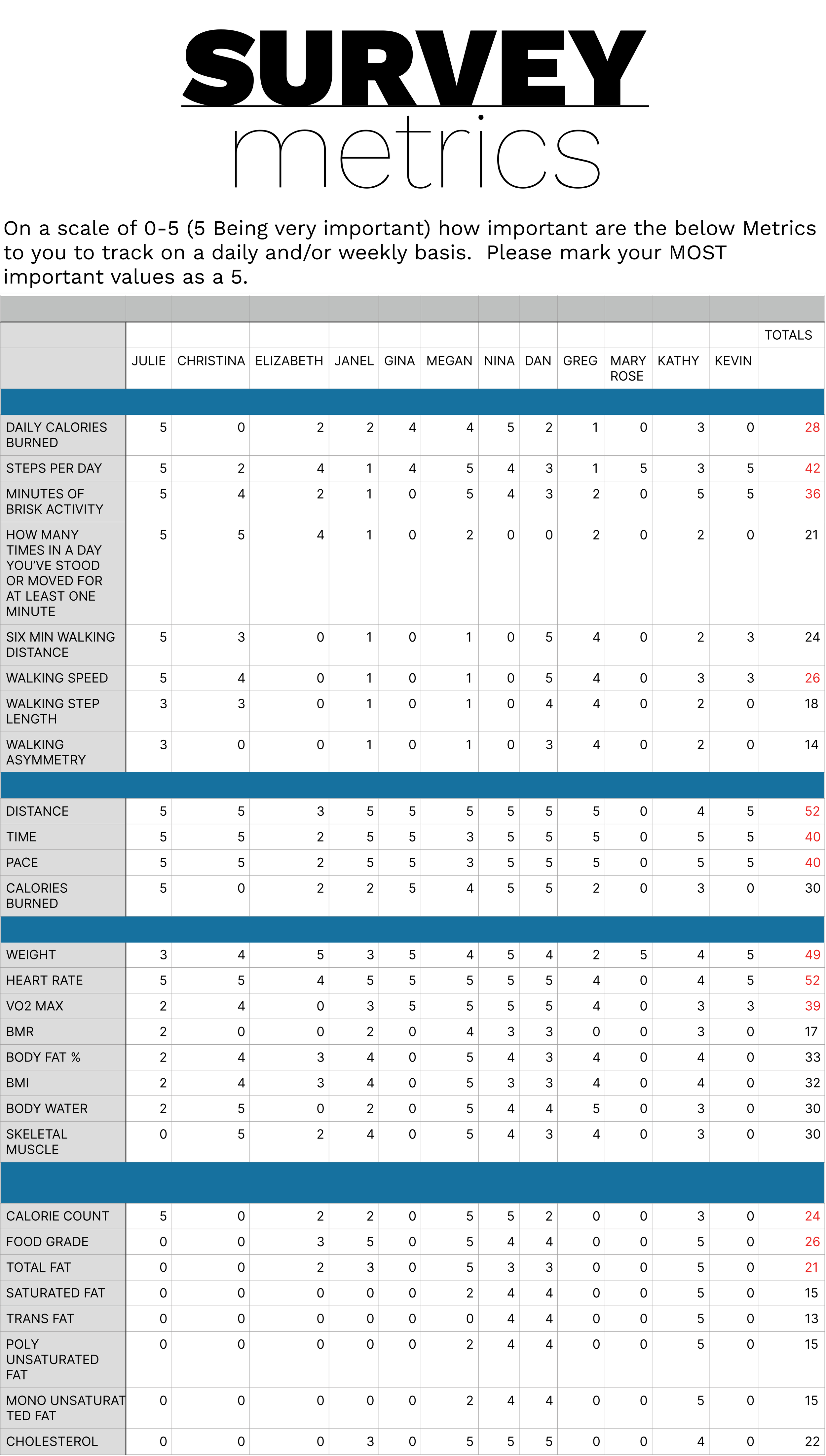
SURVEYS & INTERVIEWS
The Initial Problem Statement was too specific and didn’t resonate with my active and health minded participates, age 40+.
While almost everyone cared deeply about quality of life as they aged and on some level, were actively working to improve their exercise and diet, most believed that by staying active, eating right and being social the numbers would take care of themselves. Many didn’t feel they had the time to take it deeper than that.
In general, users didn’t understand how tracking the data could help them reach their health goals. Many users had smart watches but weren’t utilizing the majority of data provided. For example, users didn’t understand how Dr visit test data such as weren’t levels and CDC guidelines could relate back to their smart watch data and together could help them set and achieve goals.
Users are very interested in a holistic health App if the data easy to view and understand. And if i helps them set and tracked goals. Better yet if it sets and tracks goals for them.

UPDATED PROBLEM STATEMENT
Users need informative,“at a glance” health data with options to go deeper into the data. They need custom guidelines and recommendations to set goals and a clear understanding of how their “at a glance data” relates to their goals. Finally, users need the ability to connect with friends so that they are empowered to improve their overall health and well being.
DEFINE.
PERSONAS
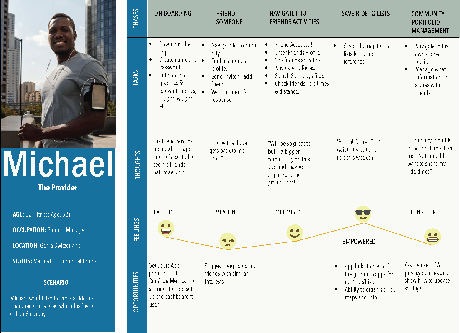
Using Affinity Mapping to organize my research, two Ideal Personas emerged. The highly engaged technical user or “The Energizer” and a working parent trying to fit in a healthy life stye where they can. “The Provider”.

-
“My motto is calories in calories out.” “I track everything including, Sleep, Steps, Get Up & Move,Distance Time, Heart Rate, all Nutrition Metrics. etc”
-
Lisa is a go getter. She runs the women’ golf league, plays pickle ball with her husband, runs, bikes, weight trains, volunteers, maintains close relationships and continues to work part time.
-
Maintain a high level of fitness and cognitive function, for as long as possible in order to continue to do all the things she loves to do.
-
Track her metrics in order to know where she stands. So she can gauge when she needs to push harder and when she can pull back. Lisa likes motivational quotes, reminders of her “Why” and calendar reminders in order to keep herself motivated.
-
Lisa and her husband are on agreed upon fixed income. Lisa has to pick and choose how to spend her money so can’t be as spontaneous as she would like to be.
-
7-8:30 am spin class or weight training
9 -1 pm work and mentoring others.
2pm Pickle Ball or golf with husband & friends
5pm Dinner with friends

-
“I’d like to live longer to enjoy my family longer in good general health.” “I’m motivated by seeing by buddies run/ride maps and times. That gives me goals and I like to talk about my fitness endeavors with them.”
-
Michael works full time at a demanding job to provide for his family. He knows his health is his greatest asset but struggles to find time to maintain it.
-
Michael would like to stay healthy in order to be around for his family and kids for years to come. He would like to have a great quality of life at retirement. His health is on his radar as he’s starting to feel his age and retirement is just 12 years away, if all goes as planned.
-
Motivation to carve out an hour and a half a day to work out either before or after his daily commute. His active friends help to keep him motivated and he likes the sharing and competition aspects of some apps.
-
Never enough Time. Appointments, meeting and family responsibilities often get in the way of Michaels health goals and plans.
-
6:30-8 am Run or ride
9 am at work
5:30 commute, errands,kids sports activities, homework and dinner
USER JOURNEYS
The Personas different values and motivations shows up in their journeys. For example, “The Provider” is motivated by friends and “The Energizer” needs frequent and efficient access to data. User journeys clarify the emotions of the user as they walk through the app and identify pain points before design even begins.

DEVELOP.
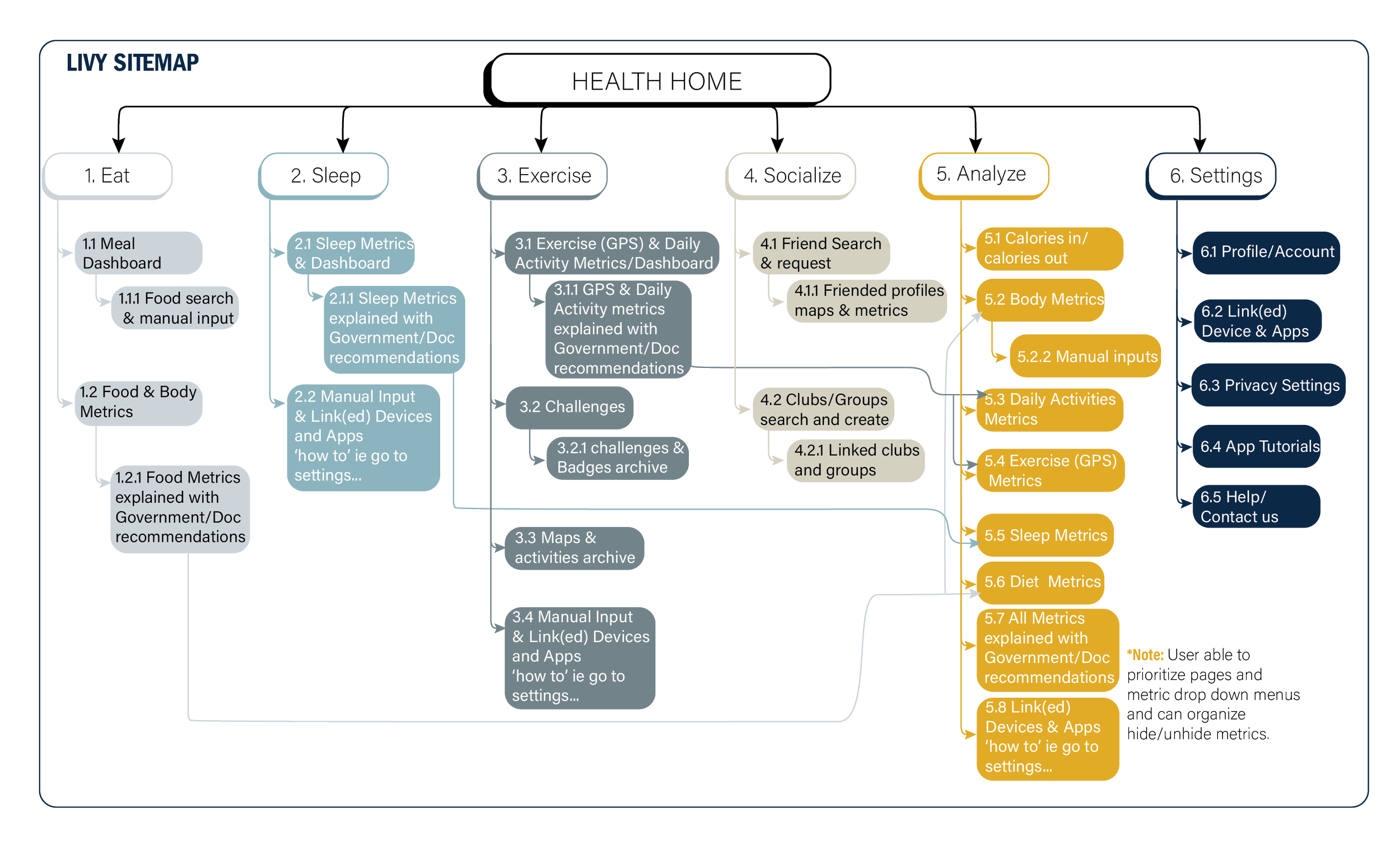
INFORMATION ARCHITECTURE
The initial Information Architecture helped to organize the ideas for the landing page of the 1st wireframes and protos. The Home Page was flushed out further after prototyping and testing.
WIREFRAME & LOW FIDELITY PROTOTYPE
Using the IA as a guide wireframes and low fidelity prototypes were created which further flush out the flow.


MID FIDELITY USABILITY TESTING
Through user testing I was able to uncover key pain points.
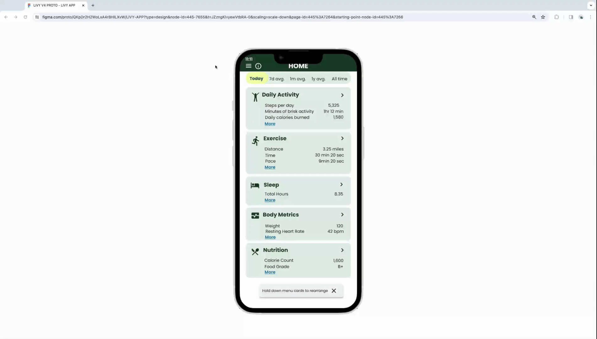
The Home Page organization and architecture wasn’t intuitive and needed revision. The “at a glance data” needed to be on the Home Page.
The Intro pages were confusing and had too many words. Needed to be cleaner and understandable “at a glance”.
PAIN POINTS
Identified through usability testing
USER FLOW NOT MAKING INTUITIVE SENSE. (HIGH) The flow of the App was not intuitive to most of the participants.
Suggested Change: Make the overall metrics page the home page. Users can both get a quick glance at their overall metrics as well as go deeper into each category.
Evidence: 4 of 6 participants called out this issue and voiced suggestions on organization fixes.

INTRO PAGES ARE CONFUSING. (HIGH) They were not serving the function of educating the user of the App and rather caused some confusion.
Suggested Change: Revisit the graphics and the wording. Add ... “health metrics” to the list of what is being analyzed. Explain the 3 main goals. 1. Easy to view and track most important metrics 3. CDC and DR recommendations/goals. 4. Collects data from smart watch and Apps.
Evidence: 5 of 6 participants called out this issue, voiced suggestions and fixes.


SCRIPT
Which do you prefer and why? Please add any suggestions.
WHAT WAS TESTED:
The first intro page was tested.
Screen 1: Used shorter more stylized category words to explain what the App does
Screen 2: Used literal category words to explain what the App does.
PREFERENCE TEST REPORT:
Screen One was overwhelmingly preferred due to shorter more concise words.
A/B PREFERENCE TESTING
Through Preference testing I was able to find the words for the Home Page that were most understood and intuitive according to actual users.
UI & HIGH FIDELITY PROTOTYPING
Through extensive feedback from peers, tutors and my mentor I further improved the UI/UX and create the high fidelity prototype in Figma.

SIGN UP, ONBOARD
Scroll through 3 splash screens
Sign Up
Add your weight, goal weight, height
Add your device (Garmin Forerunner 45S)
Go to Home page

HOME SCREEN NAVIGATION AND INFORMATION
See more metrics in Body and Nutrition
See Dr Recommendations in Information
Go deeper into Sleep Page
Find Dr recommendations in sleep page
Go to Home page
FIND FRIENDS, GET MAP
From Home Screen, Find Friends in hamburger menu
Add new Friend 'Chris Smith'
Go into Chris's profile
Go to Chris's Maps
Find "Betaso Perserve Loop, Boulder"
Save to "my maps"
Go back to your Home Page
NUTRITION
From Home page Go into nutrition screen
You had 1 cup rolled oats for breakfast. Add this to your breakfast foods.
You had 1 cup generic blueberries, Add this to your breakfast foods.
Go back to Nutrition Screen.
Go back to Home screen.
DELIVER.
Mendix Case Study
Word Lark Case Study